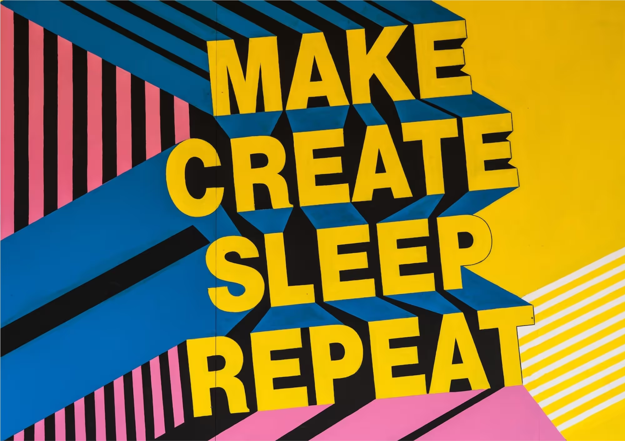
5 Essential Typography Tips for Stellar Designs
In the intricate tapestry of design, typography isn't merely about selecting fonts—it's an art form that communicates, captivates, and converts.
1. Prioritise Readability
While it's tempting to choose ornate fonts, clarity is paramount. Ensure your typeface is legible across devices, especially on mobile. Remember, search engines prioritize user experience, and clear typography can enhance your SEO ranking.
2. Harmonize Font Pairings
Mixing fonts can be a design delight, but it's essential to strike a balance. Pair a decorative font with a simpler one, or a serif with a sans-serif. This creates visual interest without overwhelming the viewer.
3. Understand Font Psychology
Just as colours evoke emotions, fonts have personalities. A classic serif might convey trust, while a playful script could evoke whimsy. Align your font choice with the mood and message of your content, ensuring it resonates with your target audience.
4. Maintain Consistent Hierarchy
Establish a clear hierarchy using font sizes, weights, and styles. This guides the viewer's eye, ensuring they absorb key messages. Headers, subheaders, and body text should be distinct yet harmonious, creating a seamless reading experience.
5. Optimise for All Platforms
In our digital age, your content will be viewed on myriad devices. Ensure your typography is responsive, scaling appropriately on desktops, tablets, and smartphones. This not only enhances user experience but also boosts SEO, as search engines value mobile optimization.
Wrapping Up
Typography, when wielded with precision and creativity, can transform your designs from mundane to mesmerizing. It's not just about aesthetics; it's about communicating effectively, engaging your audience, and optimizing for search engines. By mastering the nuances of typography


