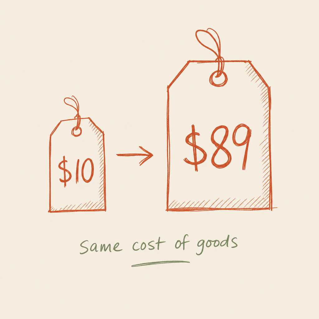
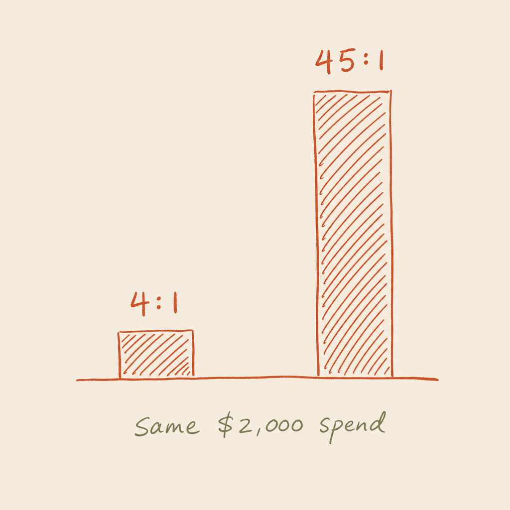


Most businesses treat brand identity as a design job. Pick a logo, choose two colours, sign it off, move on. Then the ads run under one look, the landing page wears another, the emails sound like a third company, and the ad account pays for the same first impression again every month. A cohesive identity is a performance asset. When every ad, email, page and product photo obviously comes from the same place, recognition compounds, trust builds faster, and people need fewer touches before they buy. That shows up where it matters: cheaper acquisition, better conversion, and room to charge properly instead of discounting.
Recognition Is the Cheapest Growth Lever You Have
The first time someone sees your ad, they're a stranger. The fifth time, if it looks like the same brand each time, they're warm, and warmth is free media. Meta charges you for the impression either way. On a typical NZ e-commerce account that's somewhere between $10 and $30 NZD per thousand impressions, and closer to the top of that range once Q4 bidding heats up. Every impression you pay for either deposits into a look people will recognise next time, or it evaporates the moment the thumb moves.
You already know this works, because it works on you. You can clock The Warehouse red from the far end of a carpark. You can spot a block of Whittaker's before you're close enough to read the flavour. Neither brand re-earns your attention each time; the colour does the work before a single word lands. That's the asset you build every time your creative holds the line, and the asset you throw away every time it drifts.
Drift is the expensive part. A new font here, an off-palette colour there, a tone that changes with whoever wrote the caption, and the brain files each ad as a stranger it hasn't met. You end up renting attention you should already own.
Inconsistency makes you pay for the same first impression over and over. Cohesion banks it.

Match the Ad to the Page
Here's where most ad budgets leak. The ad makes a promise in one style, the click lands on a page that feels like a different company, and the visitor hesitates. Hesitation kills conversion. The fix costs nothing: same headline promise, same colours, same voice, same hero image, so the visitor knows within a second they're in the right place and keeps reading.
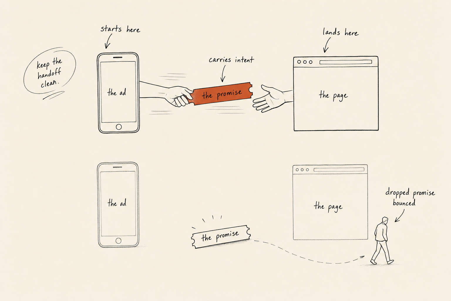
We've built entire campaigns on that discipline. An NZ excavator attachment manufacturer came to us with millions of dollars in stock sitting still and no direct sales channel. We built one landing page per hero product, matched word for word to the ad that drove the click, and stacked each page with proof from real operators. Ninety days later they had a $1.2 million qualified pipeline and more than 300 tracked prospects, from a standing start.
Another Kiwi client arrived paying $1,500 a lead on $50k a year of marketing spend. We rebuilt the whole journey so every step looked and sounded like the one before it: website, landing pages, ads, video, sales collateral. Cost per lead fell in stages, $1,500 to $1,000 to $500 to $250 to $160, and ROAS climbed from 0.35 to 3.91 over the same 12 months. Cohesion was one lever among several in that rebuild, and it ran through every one of them: make the next thing look and sound like the last thing.
Consistency Reads as Competence
Two products, near-identical specs. One looks considered everywhere you meet it; the other looks thrown together. People pay more for the first one and feel good doing it, because if the small things are handled, the big things probably are too. That's the moat. A competitor can copy your offer and undercut your price this quarter. Copying three years of compounded recognition takes them three years, and most of them will give up long before that.
Here's the gut check for whether it's working: if putting your price up 10% next week makes you flinch, the brand isn't pulling its weight yet. When it is, the same spend gets clicked on more often, turns more of those clicks into sales, and holds a higher price while it does it. Stack those three effects and they compound on each other. That's why brand work earns its place inside a performance account, sitting in the same P&L as the media buying.
Recognition Is Half the Job. Association Is the Other Half.
Being recognised only measures how many people know you. What moves money is what your name gets filed next to in their head. A brand is the set of things people pair with you, and you get to pick what those are. Every ad, page and product photo lines you up with something your buyer already wants (a result they're chasing, a face they trust, proof it works) or with something that makes them wince. Pair it well and the price they'll accept climbs. Pair it badly and all the reach in the world just sends more people past you.
This is also the honest test of the work. Comments, likes on the launch post and design awards feel like proof and aren't. The only signal that counts is whether revenue moved. A look people admire and never buy from is failing quietly, and it answers to the same scoreboard a sales page does: money.
You don't have to split the room to get there. Strong brands change what people do; they don't need a manufactured fight to get seen. Selling something real is polarising enough on its own. Make a promise a lot of people care about, keep it everywhere they meet you, and leave the controversy to brands that have nothing else to say.
The Four Things to Lock Down
You don't need a 90-page brand bible. Four decisions, made once and held everywhere, cover most of it.
- Logo. One mark that survives a Facebook feed thumbnail, a website header and a product label without losing its shape. Test it small, because small is where most of your audience meets it.
- Colour. Two or three core colours, used the same way every time. Colour is the fastest recognition trigger you have, and someone should clock your ad in the feed before they've read a word of it.
- Typography. Pick your fonts and stop renegotiating with yourself. Consistent type reads as a business that's run properly, and that does more for trust than most people give it credit for.
- Voice. Dry, warm or no-nonsense, sound the same in the ad, the email and the reply to a comment. A recognisable voice gets remembered. A voice that shifts every post gets scrolled past.
One trap those four don't catch on their own is video. More and more ads get stitched from mixed footage: a bit of creator selfie, some motion graphics, a slab of AI-generated b-roll. That's fine, and usually cheaper, right up until the styles clash. A clip that lurches between three visual worlds reads as untrustworthy even when the day-one metrics look great, because the viewer's gut clocks the seams before their head does. Hold one visual world across the whole cut: same colour grade, same type, the same logo lockup on every card. The four decisions above don't stop at the still image.
How to Tell It's Working
Cohesion sounds fuzzy until you watch the right numbers. Three signals, all free to check:
- Click-through on repeat impressions. In Ads Manager, compare CTR at frequency one against frequency two and three. When the look is landing, later impressions click through better, because recognition is doing part of the selling before the copy gets a chance. When CTR collapses on the second view, people are re-meeting you rather than recognising you.
- Branded search lift. Open Search Console and watch impressions for your brand name. Plenty of people see a cohesive ad enough times, skip the click, and type your name into Google later that week. Brand-name queries climbing while ad spend holds flat means the identity is compounding.
- Cost per acquisition at flat spend. The long-term one. Recognition lowers the number of paid touches each sale needs, so CPA on prospecting drifts down over months without the media buying changing. If yours is drifting up while your creative churns through looks, you've probably found the reason.
Run the Ten-Ad Audit
Pull up your last ten ads, your homepage and your most recent email, side by side on one screen. If they look like the work of three different businesses, you've found money on the table, because every mismatch on that screen is an impression you paid for and didn't bank.
Tighten those before you spend another dollar chasing new traffic. Lock the logo, the palette, the type and the voice, then hold them everywhere a customer meets you. Every dollar you spend after that works harder than the one before it, and that compounding is the whole point of owning a brand.
Or skip the squinting and send the ten ads to us. We run this exact side-by-side audit for NZ brands: where the look drifts, where the promise gets dropped between ad and page, and what to lock down first. It's the fastest hour you'll spend on your marketing this quarter.